Recently, the team at Obox released a highly touted WordPress CMS theme called Layers. Everyone sang the praises of how it’s the easiest thing to use, and best of all it’s FREEEEEE! The intent is to create a theme that is easily accessible for any skill level, and can quickly create a great website. While it’s a decent start, there is still a lot of work to do.
The idea is novel, and might eventually take over the landscape. This is how I like to think of using Layers at the moment: You can either purchase an iPhone and have the cool features integrated, or you can opt for the cheaper iPod Touch and a flip phone.
I will admit, I have not purchased any themes, extensions, or style kits for Layers. What you are about to read are my thoughts and experiences about the straight out-of-the-box Layers. My observations and critiques are coming from using Visual Composer and Fusion Builder for Avada for several websites in which I have been blown away by their capabilities and flexibility. The following are a handful of flaws I observed when trying out Layers, along with proposed solutions to help improve the user experience and/or the final product.
Y No WYSIWYG?
When the user wants to create a new Page, they are whisked away into the magical land of the “Customizer”. This feature has always existed in WordPress, but until now has been void of any major purpose. So now, Layers comes along and gives it a full purpose. That purpose is to utilize a series of glorified widgets to create sliders, column structures, text widgets, maps, and a host of other fun stuff. Why have a powerful Content Management System like WordPress, if you aren’t even going to manage your content in the content editor? It’s like watching the baseball game on a TV while in the stadium.
Built into the Page is a beautiful (although somewhat archaic) reading pane that has a number of valuable and complex options. I can easily switch from code to the “visual” view if I want, and see everything in a concise way. Yes, Layers tries to emulate this with their fancy display, too bad you can’t see the content on the left half to two-thirds of your screen.
What they got right:
The creators at Layers did manage to lay out the functionality in a clean manner. I do appreciate the hierarchy of the elements, although some of their functionality is a bit quirky. This layout is something I think WordPress should reconsider for their version of the WYSIWIG.
What they got wrong:
The purpose of a “What You See Is What You Get” approach is to be able to see and correct any issues in real-time rather than switching back and forth. While it is not a perfect match, users can quickly learn how to “see” the final product in the WYSIWYG. Are the users just supposed to magically guess how their content is looking when it is hidden under the customizer window? Who wants to click “close” every time when one of the big functional aspects is “view your changes instantly”?
Solution: I think the wizards of smart over at Layers should incorporate a Vertical (as present) or Horizontal option to accommodate those that do need to see the whole screen.
The Content Block Strips Out Schema Tags
Visual Composer also experiences this, although they completely strip out any information inside of your div or span. This is apparently still on their “to-do” list so if you want to go and ratchet up the pressure to get this done, go for it.
Fusion Builder leaves it alone, although the div tag is a little wonky.
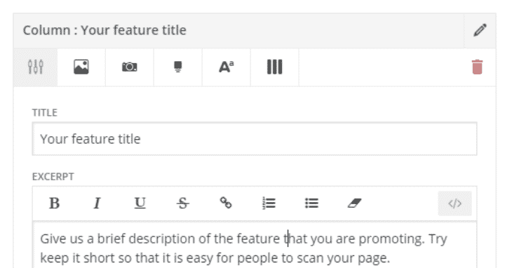
This is what I am putting into the code:
Give us a brief description of the feature that you are promoting. Try keep it short so that it is easy for people to scan your page.
This is what Layers spits out:
Give us a brief description of the feature that you are promoting. Try keep it short so that it is easy for people to scan your page.
In a quest to become the most user friendly site builder, this is an essential component that should not go ignored. Incorporating this feature would allow experts to adopt this builder and sing its praises rather than leaving professional website builders discouraged.
Solution: The best solution would be for Layers to incorporate this function into their website builder, until then unfortunately there’s not much the end-user can do other than utilizing the Text widget which is not usable in columns or for the other fun functions of this service.
No Child Theme
In my experience, every other theme I have purchased comes with a Child Theme included. It is one of the most basic features of any theme worth its salt. A lot of people might not understand the importance of Child Themes, but the team at Layers can educate their users easily with a notice to “Install Child theme” and a “See why this is important” link. A simple feature like this could both educate the lesser experienced web designers as well as appease experts that wish to see this in practically every theme.
Cluttered Media Folder with Page Templates
There isn’t much to brag about this as the Visual Composer and the Fusion Builder will also save out templates. The one caveat to this, you download a file and have to upload it again into the media loader. Why not just build it into the screen like VC or Fusion? My media folder is now littered with .json files in between my images taking up valuable real estate until they’re deleted.
It seems to me that the Layers Dropdown with Preview, Add, and Dashboard would be a perfect spot to add a “Saved Templates” option. At the very least they should add an “Add Template” option to this page. If you create a page in the normal fashion, add the “Layers Template” to the page, then you do not have the option to add some of their already fashioned layouts like you do through “Add a Layers Page”.
Shift+Click To Lose Half Of Your Screen
The ease with which the user can quickly identify and edit the section is particularly nice. With a simple Shift+Click, the correct section will pop up and the user can go about editing. This is nice for the very long pages, which can take a while to scroll through in Page view, or can take a while to render in the full screen Visual Composer editor. And there was much rejoicing.
The most popular themes I have been seeing are around $40. Why would I, a front end developer with experience in Visual Composer and Fusion Builder stray away from spending the extra $20? I know the power of the two and the immense levels of customization that I can tailor my client’s site with.
Layers is not ready for primetime.
Layers is ready for users who do not have a high level of design needs, for users without the budget for a highly functional website, or for users who might want to throw up a website very quickly
My last thought is simply this: what if it is still functionally stunted after you buy all of the fancy things for it? My money will still be spent on the best bang for the buck.
Blog Categories
Interested in a specific topic? Review the categories below and get the info, news, and tips you need based on your interest!















![How Much Should You Budget for Web Design or Redesign? [2020 Update] 25 29](https://www.atomicdc.com/wp-content/uploads/2019/12/29.png)


![HubSpot Partner Day 2019 [Recap] 31 ADC partner day 1200x630 1](https://www.atomicdc.com/wp-content/uploads/2019/09/ADC-partner-day-1200x630-1.jpg)


![30 Awesome HubSpot Tools That Won’t Cost You a Dime [Free Inbound Marketing Tools] 35 30 hubspot tools that won't cost you a dime](https://www.atomicdc.com/wp-content/uploads/2019/06/ADC-30-hubspot-tools.jpg)
