Recently Google announced that it would be switching to “Mobile-First Indexing”.
“To make our results more useful, we’ve begun experiments to make our index mobile-first. Although our search index will continue to be a single index of websites and apps, our algorithms will eventually primarily use the mobile version of a site’s content to rank pages from that site, to understand structured data, and to show snippets from those pages in our results.”
So what does this mean?
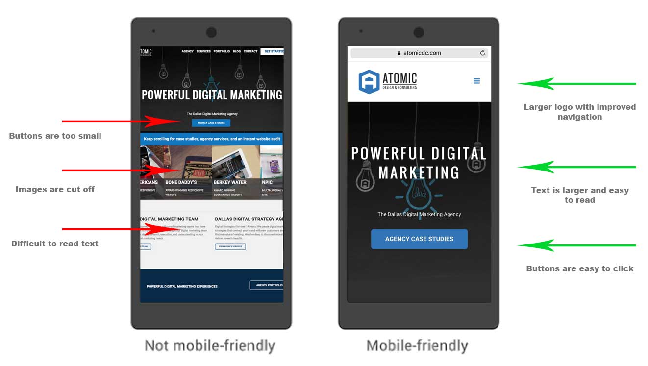
“Mobile-First” means Google will start using the mobile-friendly version of your site first in its search index. So if you don’t have a mobile-friendly website, this news will affect you.
WHAT DOES THE TERM “MOBILE-FRIENDLY” MEAN?
When a website was designed with mobile in mind. Sometimes called “responsive websites”, which are sites that can conform to the user’s device and adapt the content and layout dynamically. For instance if you have a header on your website that is 1400 pixels wide, a mobile-friendly website would scale it down to fit in the mobile screen instead of making them scroll to the side or zoom out to see the entire image.
WHAT IS A SEARCH INDEX?
Google’s search index is the list of sites it has in it’s database that can show up in the search results. If Google doesn’t know about your site then it can’t send traffic there. Not only does it know your site exists but it also collects all the data you have on your site and stores it in it’s own little database. Once it has your data it analyzes it and determines how it will present your site on its search engine. It determines things like what searches your site will show up for and what it will look like the search results page.
WHAT HAS GOOGLE CHANGED?
Ultimately it means that Google is going to start looking at the content of your website from the perspective of a mobile user and that is what it’s going to store about you in it’s database. The reason this is important is because often websites will serve different content to desktop and mobile visitors.
Typically the mobile version is going to have less content, which makes sense because users on mobile phones have limited space and bandwidth so you want to serve them the best you can. This can backfire though if you mobile version is stripped down so much that Google is going to miss all that great content you have on your desktop version. This can also greatly affect your search rankings so keep that in mind when deciding what content your want to keep.
WHY DID GOOGLE DO THIS?
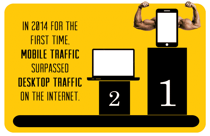
Quite simply, because Mobile traffic has surpassed Desktop traffic (In 2014) and is only gaining momentum.
Here are some great statistics on the rise of mobile traffic: https://www.smartinsights.com/mobile-marketing/mobile-marketing-analytics/mobile-marketing-statistics/
SOLUTION
1. LOOK AT YOUR WEBSITE ON YOUR MOBILE DEVICE
Anything you can’t see – Google won’t see. Therefore, they won’t index your page.
2. TEST YOUR WEBSITE
Google has a mobile website test you can use here: https://search.google.com/search-console/mobile-friendly
There are also free mobile website testers like: https://ready.mob/ & https://mobiletest.me
3. MAKE A PLAN
Last year the amount of traffic from mobile visitors surpassed desktop for the first time and it’s only growing. Everyone with a stake in the game is catering more and more to mobile users and will therefore favor websites that do too.
4. ASK A PROFESSIONAL
Getting a professional web developer on your team can be the difference between losing rankings or staying ahead of the curve. Reach out to us and we’d be happy to audit your website for potential index problems with this new change. Contact us if you have any questions about getting your website ready for the future of search.
Blog Categories
Interested in a specific topic? Review the categories below and get the info, news, and tips you need based on your interest!





![How Much Should You Budget for Web Design or Redesign? [2020 Update] 27 29](https://www.atomicdc.com/wp-content/uploads/2019/12/29.png)


![HubSpot Partner Day 2019 [Recap] 33 ADC partner day 1200x630 1](https://www.atomicdc.com/wp-content/uploads/2019/09/ADC-partner-day-1200x630-1.jpg)


![30 Awesome HubSpot Tools That Won’t Cost You a Dime [Free Inbound Marketing Tools] 37 30 hubspot tools that won't cost you a dime](https://www.atomicdc.com/wp-content/uploads/2019/06/ADC-30-hubspot-tools.jpg)


